Why should you consider a DAM?

Are your files and assets spread far and wide? If the answer is yes, then it’s time to consider a DAM (Digital Asset Management).

Many companies end up with images, logos, documents, videos, etc. stored on different PCs, backup drives and on various cloud platforms. While hard to navigate, this is usually OK until THAT person who knows where things are leaves or is off sick. Or maybe you are that person, and feel like most of your day is spent sending people assets and files they need!

That’s why a DAM system is an important tool for marketing departments.

An effective DAM provides a platform ready for you to centralise your assets. A platform that can stop requests for your logo, ‘that image of that thing’ or ‘the latest presentation’ – ultimately saving significant amounts of time for everyone involved.

Get yourself set up right.

Many DAM solutions can be overly complicated and expensive to implement. However this doesn’t need to be the case. Consider what you actually want a system for, which is normally to house assets in a simple to access fashion. The correct system should then be something that does this well, and is simple and easy to use by everyone.

In tailoring a system to your business, we recommend considering:

  • Access Levels: Set up suitable access levels so users can only access assets relevant to them
  • User Experience: This one is key. Make it simple to navigate or it will not be used! Organise your assets logically into categories and folders that make sense to your users
  • Branding: Design the DAM in your brand style to create a familiar on-brand experience for users
  • Asset Tagging: Tag your assets with relevant keywords, so that a simple search will display the assets required
  • Audit Trail: Keep a record of who’s downloaded what, and when they downloaded it
  • Cloud Based: A cloud based solution means no new software to implement and anyone can use it anywhere, on any device, at any time
  • Security: Ensure HTTPS and SSL protection to keep your assets secure
  • Future Proofing: Making sure storage capacity is scalable as your business grows and that new users can be added at no additional cost to save your costs spiralling in the future

The right DAM really can be a welcome relief, saving you time and improving marketing efficiency. The key is in selecting one that’s right for you and your business.

If you’d like to discuss how our DAM solution could work for your business, please get in touch.

Our DAM solution is cost-effective, fast to implement and simple to manage. And the best bit? We’ll set it up for you!

But don’t just take our word for it, here’s what our client said…

Our clients love what we do!

The DAM Jask created is such a welcome relief. All of our assets are stored logically, making the tracking down of logos, images or documents so much easier and quicker for everyone.

We had an existing DAM that just wasn’t getting used, it was overly complicated and highly-priced. Jask was able to create a new solution for us, that really works. This is a DAM that can be used by everyone, it’s simple, intuitive, and easy to manage.

As for Jask, they were a pleasure to work with, they made the process straightforward and pain-free.

WooCommerce vs BigCommerce – Which Is Best For You?

BigCommerce and WooCommerce are two of the better-known eCommerce platforms. Like any other E-commerce platform, they enable E-commerce merchants to build their online storefront. They are both excellent platforms with a full suite of options to run a successful online store. However, they are both very different, and different businesses will certainly do better with one or the other.

WooCommerce is clearly the more popular platform of the two as it makes up over 26% of all E-commerce stores online Compared to BigCommerce’s 3%. Does this mean That you Should choose WooCommerce because it’s more popular? Well, hold on just a second as just because it’s more popular does not innately make WooCommerce the superior platform.

The biggest difference when it comes to the platforms themselves is that Bigcommerce is a hosted platform whereas WooCommerce is a WordPress plugin – Where WordPress is a content management system that you install for free on a server that you lease from a hosting company.

A third thing to keep in mind is that BigCommerce is available as a WordPress plugin too. In this case, BigCommerce operates the exact same as WooCommerce but it syncs all data with an E-commerce dashboard at BigCommerce.

Pricing

BigCommerce is available as part of a monthly subscription offered in 3 stages: standard, plus, and pro, which are priced at $29.95, $79.95, and $299.95 respectively. The differences between the three plans are minimal 

As a free plugin for WordPress WooCommerce has no costs in and of itself, however, most WooCommerce stores require the implementation of extensions – which can quickly add up to $30-$250 one-off spends. In addition to this costs for hosting and domain names work out at an average of around $150 annually for most stores.

Even so, BigCommerce typically works out as the more expensive option in regards to upfront costs.

Ease of use

Having weighed up both these platforms, it appears that despite BigCommerce’s initial learning curve, it’s easier to use than WooCommerce, namely, because it provides excellent onboarding, a plethora of built-in features, and high-quality customer support along the way (more on that in a sec). Whereas, WooCommerce is a better choice for a more technical user or someone already familiar with WordPress’s interface.

Flexibility

BigCommerce prides itself on being one of the more flexible software as a service platforms. When compared to its main competitors such as Shopify this is immediately apparent. BigCommerce excels both from a design and functionality perspective and if you want to do something slightly out of the box, you usually are able to do that. However, it is never going to offer the same level of Flexibility as an open-source platform such as WooCommerce. WooCommerce has been a stalwart of open-source E-commerce platforms since its release, and it continues to be one of the better options within this space. While its main open-source competitor – Magento boasts being more scalable or more tailored for E-commerce in general, it is simply far too complicated for most people to use effectively. WooCommerce, although still complex, is a more accessible open-source platform.

Pros & Cons

BigCommerce pros

  • Acquisition of Feedomonics – Feedomonics is a product feed platform that allows you to syndicate and list your products on 100s of different marketing and advertising channels such as Google Shopping, Amazon, and Facebook. Feedonomics supports many E-commerce platforms but as of July 2021, is likely to give preferential treatment to BigCommerce. 
  • No hassle speed and security – Speed is one of if not the most important things for an E-commerce store. The all-in-one capability of BigCommerce allows you to offload the technical challenges (without having to dedicate a significant budget to development) & meet your customers’ expectations for an easy shopping experience.
  • Intuitive built-in features –  Many of the third-party plugins you would implement as a part of a Shopify or Volusion store are already built into the core BigCommerce application. Be it reviews, 301 redirects, or abandoned cart saver – BigCommerce likely has it already.

BigCommerce Cons

  • Pricing – Although available in multiple tiered prices the upfront subscription costs of BigCommerce are only the first in a number of fees you will likely have to pay as a part of having a BigCommerce store. With many add-on features costing you extra and BigCommerce having an additional fee for every transaction.
  • Limited functionality – Limited is of course relative as you will likely be able to implement almost anything with a BigCommerce site. But that is the key word – Almost. 
  • Limited app store – Compared to similar self-hosted platforms such as Shopify and Volusion, BigCommerce’s app store is nowhere near as extensive. Many features are built directly into the site but still, the availability of features will likely never match its competitors.
  • Lock-in – If a situation arose wherein you did want to switch from Bigcommerce to a self-hosted platform such as WooCommerce; It’s not quite a 2 click process and in fact, it will usually cost you quite a lot of time and money to do so.
  • History of rebrands – For whatever reason BigCommerce can never quite settle on what kind of businesses it is trying to cater to. In the past 5 years, they have had 5+ redesigns and their logo has changed several times. This might not sound like a big deal but it means that the company is less focused on fixing customer service issues that have been complaints for several years.

WooCommerce Pros

  • Great flexibility – If you can think it, Woocommerce likely allows you to do it. Products can be categorized, given sale prices, independent attributes, and more.
  • Payment gateway support – As an E-commerce business you won’t get very far without the support of digital payments. Square, Stripe, PayPal – you name it. With so many options available on WooCommerce you can take time choosing the right partnership for you.
  • Inventory locations – Allocate inventory to warehouses, retail stores, or other locations where you offer your products. 
  • Unlimited bandwidth and online storage – Merchants will not be charged based on the number of visitors in their store or their storage space. You can also sell unlimited products.

WooCommerce Cons

  • Ease of use – Out of the Box, WooCommerce can appear a tough mountain to climb. unless you have some coding knowledge, you’ll struggle to truly build the online store you want on WooCommerce.
  • Growth and scalability – As a WordPress product WooCommerce’s functionality is not built specifically with E-commerce in mind but instead versatility. The way WooCommerce works means it starts to break down when you get above a certain threshold of “queries”. This is something that can be worked around however it is a huge undertaking for most stores.
  • Hosting – This could be considered a benefit but compared to Shopify it is a Con. WooCommerce does not offer its own hosting and as a new store, it is an extra thing you have to think about. Some people prefer to have control of their own hosting however in this case it is a con.

Summary

BigCommerce is looking to grow its base to compete amongst its other, more popular ‘software as a service’ competitors. Compared to WooCommerce it is a much easier platform to use. WooCommerce on the other hand allows you to do much more with your site due to its flexibility. The choice will likely be decided by the cost, whether it’s time or money that most concerns you as with Bigcommerce there are more upfront and solid costs, whereas WooCommerce will cost you much more of your time.

Find out how Jask can build and develop a WooCommerce store for you.

If you’d like to hear more about how Jask can help your business, feel free to contact us.

Magento vs WooCommerce – Which is best for you?

Magento and WooCommerce are two different E-commerce platforms that allow E-commerce merchants to run their business.

Magento used to be a much tougher competitor to WooCommerce until Magento’s acquisition by Adobe in 2018. In recent years, the number of E-commerce stores it makes up has decreased, with WooCommerce making up 26% and Magento making up 10% (stats gathered January 2021). Despite WooCommerce being a far more popular platform, both Magento and WooCommerce have fairly strong communities. This is because the two platforms are both ‘open source’, meaning that their underlying code can be contributed to by other developers.

It is important to note that Magento comes in 3 variations: Magento open-source, Magento Commerce Cloud and Magento On-Prem the latter two of the three fall under the Magento Commerce umbrella. The confusing aspect is that all 3 are technically open-source despite it only being the namesake of one of them. The three versions have some major differences in spite of this innate similarity, which we will get to shortly.

Pricing

The biggest difference between these two platforms comes down to price. WooCommerce is a free plugin for WordPress – where the only ongoing costs are that of the hosting environment and the domain name. Magento’s pricing on the other hand can be a little confusing.

Magento open source is free-to-download and use, whereas both Magento Commerce versions are paid. The difference between the on-prem and commerce cloud versions is in the hosting. Commerce cloud is self-hosted via a partnership with adobe and is therefore referred to as a PAAS or ‘platform as a service’ – this is the version Adobe really wants you to choose. On-prem (short for on-premises) requires you to find a hosting platform yourself. Neither of these two has a set price.

Magento Commerce has an annual licensing cost ranging from $22,000 to $190,0000 depending on the size of your business. Basically, if you earn more they charge you more.

Ease of use

As two open-source platforms, neither Magento nor WooCommerce are particularly easy to use, although if you’ve used WordPress before you’ll have a head start with WooCommerce.

With WooCommerce, even though the setup process is a little bit complicated compared to hosted platforms such as Shopify or BigCommerce, it’s still more user-friendly for those who don’t have a lot of experience in web development. Magento on the other hand does not try to cater to non-developers in the slightest – even the initial setup is written with web developers in mind.

Scalability

Magento may have a better reputation in this area, however, most of that comes from a high proportion of WooCommerce stores being setup in a “DIY” fashion and hosted on an inadequate infrastructure, this is an unfortuante effect of the very low barrier to entry that WooCommerce has. In this situation any eCommerce platform would perform poorly (as would Magento), however, setup correctly and hosted on suitable managed infrastructure, WooCommerce can handle large amounts of traffic.

Pros & Cons

Magento pros
  • A large community of developers – Due to it being a very complex platform Magento has attracted a large community of developers who simply enjoy the challenge of working with the platform. So, if you are ever stuck as to what to do, finding someone to assist shouldn’t be too hard
  • Hosting – Magento is the only major platform that offers a choice between being self-hosted or not.
Magento cons
  • Ease of use – Magento is the web developer’s E-commerce platform. It is not designed to be used by small business owners without in-house development support.
  • Cost – With the exception of the free version Magento has steep upfront costs. In addition to this as a complex platform costs for developers and maintenance can be expensive. 
  • Choosing which version to use – As there are three different versions of Magento, deciding which one is best for you can be tough. It is also not made immediately clear which of the three is best for you and your business. 
WooCommerce Pros
  • Great flexibility – If you can think it, WooCommerce likely allows you to do it. Products can be categorized, given sale prices, independent attributes, and more.
  • Payment gateway support – As an E-commerce business you won’t get very far without the support of digital payments. Stripe, Square, PayPal – you name it. With so many options available on WooCommerce you can take time choosing the right partnership for you.
  • Inventory locations – Allocate inventory to warehouses, retail stores, or other locations where you offer your products. 
  • Unlimited products – Merchants will not be charged based on the number of products. You can also sell unlimited products. 
  • Ease of use – Out of the Box, WooCommerce can appear a tough mountain to climb. And for first-time users, there will likely be a learning curve in figuring out WooCommerce’s. However, compared to Magento it is much easier to wrap your head around. 
WooCommerce Cons
  • Scalability – Compared to Magento, scaling WooCommerce can be difficult on your own. Getting the expertise of an experienced WooCommerce developers is required to scale WooCommerce stores to account for higher volumes of queries.
  • Hosting – Having to find your own hosting is not in and of itself a con towards WooCommerce. However, with Magento you are given a choice – do you want to host your site yourself or have it hosted through Adobe.

Summary

Magento and WooCommerce are two similar platforms in the E-commerce industry. They are both Open source platforms that boast similar levels of flexibility. 

Magento is seen as the number one E-commerce platform for larger companies trading online. It offers very powerful caching mechanisms and ways to serve content in a way that makes the user’s interaction much simpler, this is something that WooCommerce will not offer out of the box. However, to combat this, various other options are available at a server level to provide the same functionality and speed.

As Magento offers these advanced caching mechanisms, an experienced web developer is required in order to create and maintain the site, and a more advanced understanding of the CMS is required to add site content.

Magento is simply too advanced for the inexperienced user.

Get to Know 5XX Server Errors and How to Fix Them

When browsing the internet and accessing a website, you might encounter a 5XX error. This means the server is unable to return your request.

When that happens, the browser will show a string of numbers starting with the digit “5” to indicate there is a problem with the server. Some of the most common variants include 502 Bad Gateway, 504 Gateway Timeout, and 500 Internal Server Error.

So if you’re wondering what they mean and how to troubleshoot them, you’re in the right place.

This article will show different types of 5XX server errors, why they might happen, and the solutions to help you continue browsing – from simply reloading the web page to deleting browser cookies.

Without further ado, let’s jump right in.

What is a 5XX Server Error?

5XX server error refers to problems with a server being unable to return a request.

When accessing a website, the browser sends a request to the server of the site you’re trying to reach. If the request is successful, the server will return the required resource. If not, it sends an error code such as:

  • 3xx – redirection
  • 4xx – client error
  • 5xx – server error

Some of the main causes for 5XX server errors include factors such as firewall blocks, maintenance issues, server overload, and unresolved domains.

The 5XX server error prevents users from accessing web pages and content from websites. Thus, it’s important to understand how users can continue browsing the website when encountering such errors.

Types of 5XX Server Errors

Errors with 5XX status codes indicate there’s an issue with the server. These error codes vary from 500 Internal Server Error to 504 Gateway Timeout.

In this section, we’ll take a look at some of the most common 5XX server errors you might encounter while browsing the internet, what they indicate, and a little about how to fix them.

500 Internal Server Error

This is a generic error message when the server cannot fulfill a request and identify the exact issue.

However, some of the main causes for this error include:

  • Application is shutting down or busy restarting on the web server.
  • Web server is too busy.
  • Direct requests are not allowed.
  • Configuration data is invalid.
  • Internal ASP error.

Try fixing the error by reloading the page, clearing the browser’s cache, or simply trying again later.

502 Bad Gateway

502 bad gateway is a common error message when a proxy server receives an invalid response from its origin server.

Common causes for this server error are:

  • Origin server overload.
  • Unresolved domain name.
  • Browser issues.
  • Network equipment troubles.
  • Firewall blocks.

Troubleshoot this error by accessing the website using Incognito mode. If that doesn’t work, try restarting your computer or network equipment.

503 Service Unavailable

This message is a common error status code that appears temporarily when a site’s server is unavailable. Some of the most common scenarios include website maintenance and busy servers.

If you see this error, try visiting the website another time or reloading the page as the issue is only temporary.

504 Gateway Timeout

This status code is sent back when a proxy server cannot complete a request within the given time frame.

Several problems that can cause this error include:

  • Connection error.
  • Server overload.
  • Firewall issues.
  • Unresolvable domain.

Try resolving the problem by reloading the page or restarting your network devices. Alternatively, try accessing the website using a different browser.

How to Fix 5XX Server Errors

Here are several ways to troubleshoot when you encounter these errors while trying to access a website.

1. Reload the Page

Simply reloading the web page can troubleshoot specific 5XX server errors because some issues are temporary and fix themselves.

To refresh the page, wait a few seconds or minutes depending on the situation, and press the reload button () on your web browser. Alternatively, use shortcuts such as F5 or CTRL + F5 for Windows users and CMD + R for Mac users.

Additionally, try checking if the website is online using tools such as Host Tracker or Website Planet. This gives insight into whether the error is a server or client-side issue so you can find the right approach to troubleshoot the problem.

2. Clear Browser Cache

Clearing cache lets your browser remove outdated and corrupted files and retrieve the latest content from the website, which oftentimes is an excellent solution to fix a 502 Bad Gateway error.

Additionally, this action is great to prevent malware and viruses in malicious content from harming your computer.

Luckily, clearing the browser’s cache is a simple process. For instance, if you’re using Google Chrome, use the keyboard shortcut Ctrl + Shift + Del on Windows or Command + Shift + Delete on a Mac.

Understand that clearing cache might lose important data such as bookmarks and setting preferences. Consider preventing this by exporting your data prior to removing cache and importing it back afterward.

3. Delete Browser Cookies

Cookies from the website you’re trying to access can be the cause of the 5XX error. If so, delete the cookies, restart the browser, and try again.

The steps to deleting the cookies differ depending on the web browser. However, you can perform this action on most browsers by using the Ctrl + Shift + Del shortcut keys on Windows and Command + Shift + Del on a Mac. 

If you want more control, you can delete cookies from a specific website only.

4. Try Incognito Mode

If all previous efforts fail to load the website successfully, consider accessing it using Incognito mode on your browser.

This method is great to identify whether the issue is server or browser-related. If the error is absent in Incognito mode, the issue might be browser-related, typically caused by a browser extension.

If so, try disabling your extensions and add-ons, and see whether it fixes the problem. If not, try another browser. If the website loads normally, it means your previous browser causes the error. Try solving the problem by reinstalling the browser and accessing the website once again.

5. Check Internet Connection

Before accessing the internet, ensure a stable connection to prevent your browser from triggering a 5XX server error.

To be sure, try testing the connection on another device to ensure the error is related to your network.

If your internet connection is unstable, consider restarting your router or modem. Make sure to wait a minute before switching it back on. When done, reconnect your device and reload the website.

Alternatively, connect to another network and access the website. If the site loads perfectly, then the issue is likely caused by your connection.

Conclusion

5XX server errors happen when the server is unable to return the requested content. Instead, it sends a status code that appears on the browser, informing visitors of an error.

Here are several types of server-side errors we’ve discussed in this article:

  • 500 Internal Server Error
  • 502 Bad Gateway
  • 503 Service Unavailable
  • 504 Gateway Timeout

As a client, here are the steps you can take to troubleshoot a 5XX server error:

  • Reload the page
  • Clear browser cache
  • Delete browser cookies
  • Try accessing using Incognito mode
  • Check your internet connection

There you have it, some of the most common types of 5XX server errors and ways to fix them.

Hopefully, you’ll be able to troubleshoot any 5XX server errors and continue browsing with ease from now on. Good luck!

Responsive Web Design: The Must for Modern Web Projects

Responsive web designs have gained an astronomical amount of momentum over the last decade thanks to the rise of mobile usage. Do you remember the times when you had to zoom in to a shrunken version of a desktop site on your phone? Certainly not ideal. And certainly not a user friendly experience, as you were most likely viewing a static website.

Thankfully, those desktop-only days are gone.

But, what exactly is responsive web design?

The term ‘responsive web design’ was coined and largely developed by Ethan Marcotte. His article ‘Responsive Web Design in A List Apart’ covers the concept of building a website that responds to the surroundings of its media type and size.

Our screen sizes are forever changing. Think phones, “phablets”, tablets, desktops, game consoles, TVs and even wearable devices such as smart watches. Smaller devices are often constrained by their display size and require a different approach. It’s more important than ever before to design and build a website that can adapt to every device and screen size – today or in the future – to provide an intuitive and gratifying user experience for everyone.

Responsive web design is dependent upon three things:
  1. Media Queries
    A popular technique used to modify the site depending on the device’s characteristics or parameters (such as the browser viewport or screen resolution). Media queries are logical expressions that test for the device’s value which can then be resolved to either true or false. This enables web designers and developers to add conditions to their styling and customise the presentation of the website to specific devices and screen sizes.
  2. Fluid Grids
    A web grid utilises a column design to manage the space and layout of a website. It can be either fixed or fluid. A site built with a fluid, flexible grid adapts the content, so after the media query, the site will restructure itself and cascade the information accordingly to the screen size it’s being viewed on.
  3. Flexible Images
    Also known as adaptive images. Typically, when you upload an image to a website it has an absolute set width and height. A fluid and flexible website isn’t all that flexible if the content elements are fixed, which would completely defeat the purpose of having a brilliantly set out page. The media queries detect the screen size and then it automatically scales and resizes all the images.

Inevitably, the revolution of responsive web design has meant that web developers have had to adapt responsive design and functionality into their bespoke website designs. Today, the majority of people are familiar with the capabilities of responsive design.

However, if you’re still a bit unsure, simply shrink your browser down and watch the magic happen. Great responsive websites should automatically rescale themselves as you change the browser window size.

Great responsive websites examples:

To show you some remarkable examples that implement responsiveness in all its glory, we’ve tasked our resident web developers and user experience experts to pick out their  favourite websites.

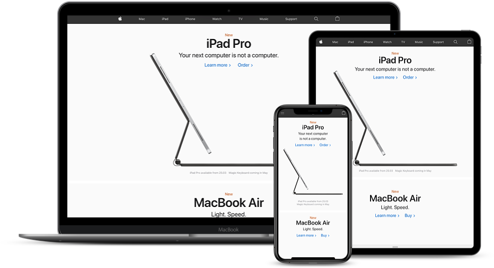
Apple

It’s no surprise that we’re all massive fans of the tech giant here, don’t trust a creative that doesn’t utterly adore their Apple devices. Our web developers comment on their enthusiasm for Apple’s streamlined approach to scaling and flexible images:

“Apple changes certain images for different screen sizes, for example the MacBook Air changes from horizontal image to a more vertical image. It’s pretty cool as it makes more use of the vertical space available on mobile devices”

Kyle Russell
Web Developer

“The website scales their animations and interactions down really well on smaller screens. A lot of sites just remove them completely and scale things right back and cause the mobile experience to be much more compromised when compared to the desktop experience.”

Luke Turner
Technical Director
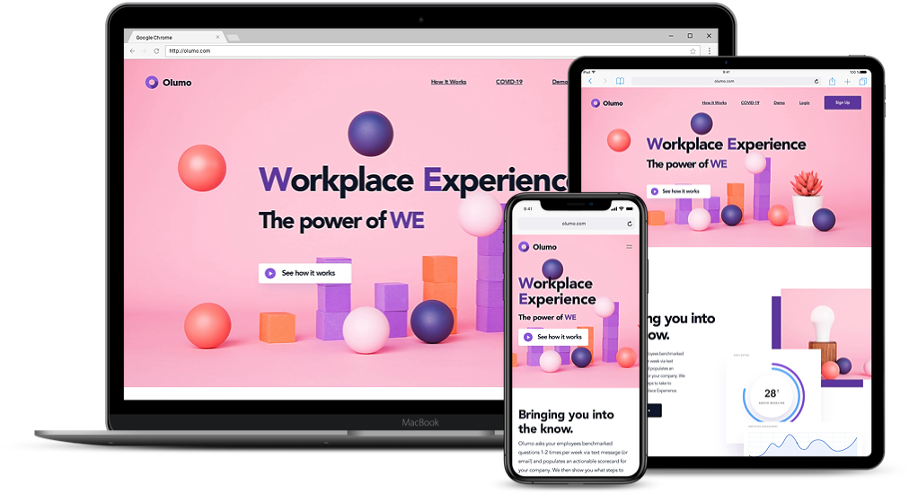
Olumo

Innovative work experience and solution company, Olumo, takes responsive websites to another meaning. They utilise a clean cut design with high contrast complimented with responsive animations. Our user experience and graphic designer comments: 

“The floating elements of the website smartly pan as you scroll further down. Changing to mobile shows how cleverly each asset has been designed as all information stacks neatly above each other for a smooth user experience.”

Callum Bedward-Brooks
Creative Designer
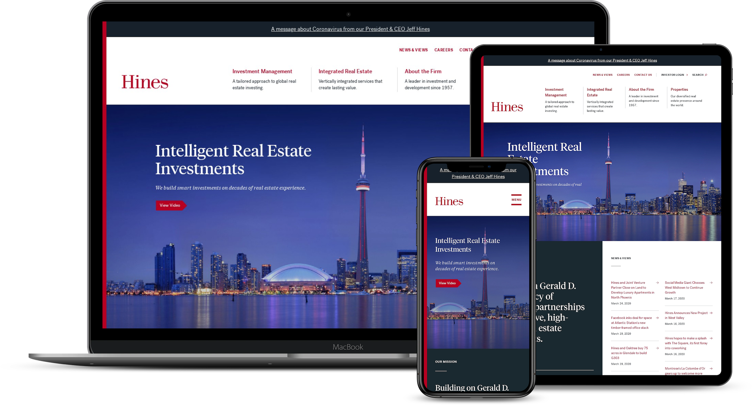
Hines

Intelligent real estate investment company Hines, caught the attention of our Digital Project Manager. She comments:

“B2B websites tend to focus on desktop experience purely because it’s usually browsed during office hours and most likely on a stationary or laptop device. It’s always interesting to see the different approaches companies take when making their sites suitable for people on the move; what I love about Hines approach is the attention to detail. On desktop, the larger menu is clearly divided in primary and secondary, with the primary menu having further support information so people know what to expect from the page. On mobile, the menus are hidden behind a burger menu that cleverly has a word “menu” as the middle stripe. The pages are very engaging and attention capturing and this mixture of media and text does not get lost on a smaller device version of the site.”

Kristiana Briede
Digital Project Manager

Things to consider when designing a responsive website

After seeing some good examples of responsive websites, you’re probably itching to dive into a new web project or tempted to pick up that phone and start calling our brilliant web developers here in Birmingham. But, before you do, there are a few considerations you should bear in mind.

  1. Functionality
    Many web designs come with wonderful graphics and are a representation of true art. However, we shouldn’t forget that a website is an online marketing tool, first and foremost, and no matter how pretty your site is, if it fails on being practical to the end user, then it fails altogether. Your site must now account for mobile functionality and how it interacts with users on touch screens. Take into consideration the differences between using a mouse and finger for touch screens. Fingers allow for bespoke functions such as pinch zoom.
  2. Screen Real Estate
    Screen sizes vary massively, from desktops to tablets and smartphones. The space your website has to work with, has to adapt accordingly to the device. Condensing your site into spaces that can be no larger than five inches is a difficult task, you should strategically place the content that’s best for the end user. It’s best to reduce the content and focus on the key information rather than overloading your site with large amounts of text. Often you’ll find the simpler it is, the better. Cliché but true.
  3. Your Audience
    A lot of these considerations boil down to who the target audience of your website is. Put yourself in their shoes and envision what they would want when they are viewing your site from tablet or smartphone. Their user journey and experience is what matters the most. If your website isn’t intuitive and has complex navigations, this creates a difficult time for your end user and your conversion rate ultimately suffers.
Go Mobile or Go Home

Since the introduction of Apple’s first iPhone, smartphones have grown year on year to become the basic standard and the norm for people to have in their pockets. Access to the internet is no longer for the tech savvy but for anybody and everybody at the tap of their fingertips.

Back in 2015, Google rolled out a change in their algorithm to factor in a website’s mobile presence and usability as a significant factor in Google’s search ranking. Neglecting to accommodate a mobile friendly website will not only negatively impact your overall success in search engines but it also drives potential leads away. 40% of users have gone to a competitor’s website after a poor mobile experience, not to mention there are now more searches on mobile than desktops, with mobile devices now accounting for 52.6% of global web traffic

Think about it, how often have you been sat with a smartphone in your hand, wanting to make a purchase or access some further information, only to find your would-be seller has a poor mobile website that doesn’t work or you can’t find what you’re looking for? It frustrates us beyond belief. That’s why most smartphone users won’t put in the effort to browse a website that isn’t mobile friendly, especially when they can easily hop right back to the search results and go to another site that’s easy to navigate. 

Put simply, your mobile site speaks volumes. It needs to be dedicated with all your essential information, products, services and contact details squeezed into one easy to use and beautifully presented bite sized portion. Increasing your digital presence, improved customer journey and maximising mobile conversation rates are some of the few benefits of a mobile responsive website. We’ll have another blog coming out soon that covers mobile friendly websites in depth, so be sure to come back and check it out.

So there you have it, everything you need to know about responsive websites and why mobile friendly sites are imperative to a business’ success. Above all else, long hard planning and research needs to go into a responsive website, and giving due care to improved user experience is what we believe is the ultimate goal to a sustainable website.

Even though we’re clearly web fanatics, we’re more than a responsive web design agency in the West Midlands – we also have spectacular graphic designers to boot too. From web designs, web hosting and bespoke content management systems to creative design services, we’ve got you covered for your all marketing needs. 

Web Terminology 101: Website Design Fundamentals

So you’re looking to take your business to the next level by building a new website. Or perhaps you’re refining and redesigning your current website? But all of a sudden you’re drowning in an endless sea of technical website jargon. We get it – web vocabulary can be overwhelming. Especially the acronyms – CTA, UX and now SEO too…

There are countless specialised terms referring to every aspect of web build projects. But, we’re here to help.

In this helpful guide, we focus on web terms commonly used in web design. From user experience to accessibility, we share our insider knowledge on some of the most useful web design related vocabulary. Start with these fundamental terms below and you’ll be having comfortable two-way conversations with web developers in no time!

Web Vocabulary List

1. Mobile

Traditionally, most web designers approached web projects desktop first. In the last decade, mobile traffic has rapidly increased and it now contributes at least 52.2% of global web traffic. With this in mind, many web designers have shifted to designing for smaller screen devices first. This is what we call “Mobile First Design”.
Mobile First focuses on providing a better user experience on smaller screens by adapting the key information and interface from a desktop website – less text, larger fonts, faster download speeds, one call-to-action per page etc. This enables the user to navigate through the same website without hindrance and enjoy the website as much as they would as if they were viewing it on a larger screen. This has become even more important since Google introduced algorithm updates relating to mobile-friendly websites.

2. Responsive

Responsive design refers to a style of website built around a fluid grid. The website detects the visitor’s device screen size and orientation, then it adjusts the layout accordingly. With responsive websites, the content is dynamic. The text, images and spacing react with user experience in mind, shrinking or enlarging the components to enhance usability.
While this sounds similar to mobile-first – it’s not the same thing. Mobile-first websites do not change based on the device viewing it. However, a mobile-friendly website can be achieved through a responsive design. At Jask, our best practice is to design a mobile-friendly layout first and then build the site in a responsive way so that our websites are both mobile-friendly and responsive for all devices.

3. User Experience

The user experience, also known as UX, is a design concept that encompasses all the interactions a user has with a website until the desired conversion is achieved. As the name suggests, the goal of UX is to provide a quality, meaningful and relevant experience to the user. A user-friendly website has been built with the user in mind – it’s simple and intuitive to navigate through the site, loads quickly and includes clear call-to-actions such as “learn”, “play”, “join” etc.

4. Above the fold

This term has been inherited from the newspaper industry, it was used to describe the top section of a newspaper that could be seen whilst the newspaper was folded once they hit the newsstand.
In web design terms, the “fold” refers to the part of a website that is presented to the user before they have to scroll down. The “fold” is crucial to hook visitors from the second they land on the website. Planning for the first impression is instrumental in encouraging visitors to stay, explore the site further and convert.

5. Cross-device

Now more than ever, consumers are using multiple devices to search, research and purchase products. Whether they’re browsing on the go on mobiles or at home on smart TVs, consumers want the same user experience. Cross-device is a term used when web designers take the user’s journey into consideration to ensure the users’ needs are met on each of their devices.

6. Landing page

A landing page is a standalone page on a website that is designed to highlight a particular area of service or product. The sole purpose of a landing page is to convert visitors into leads. Rather than directing visitors from paid ads, email campaigns or social media posts to a general website, the landing page steers them into the direction the page is designed to take them.
For example, an e-commerce company typically presents an advert across the web advertising “Up to 50% off swimwear”. Once a visitor clicks on the ad, the ad sends the traffic to a page that has been set up that showcases the swimwear included in the offer. This improves the user experience, compared to sending visitors to the home page which would force people to have to find their own way through.

7. Accessibility

Web accessibility is an inclusive web development practice to ensure there are no barriers preventing people from using a website. When a website has been designed and coded with accessibility in mind, it increases its ability to be used by people with disabilities.
For example, visually impaired visitors often use screen readers or use settings to accommodate their colour blindness. Websites with visual accessibility features enable the user to adjust to the colour scheme, contrast and enlarge the text.

8. CTA

CTA is an acronym for “call-to-action” and in essence is a marketing term that refers to a piece of content such as an image, a button or a line of text that prompts users to act on a specific action. The content uses action-oriented words or phrases such as “read more” to encourage an immediate response. They’re often strategically placed in a prominent position on a website or landing page to help guide users and increase conversions.

We hope you’ve found this guide is useful, you’re now ready to converse with web designers like an expert.

Were there any terminologies that you haven’t come across before this article? Let us know by tweeting us or contacting us directly.